Chart comparison
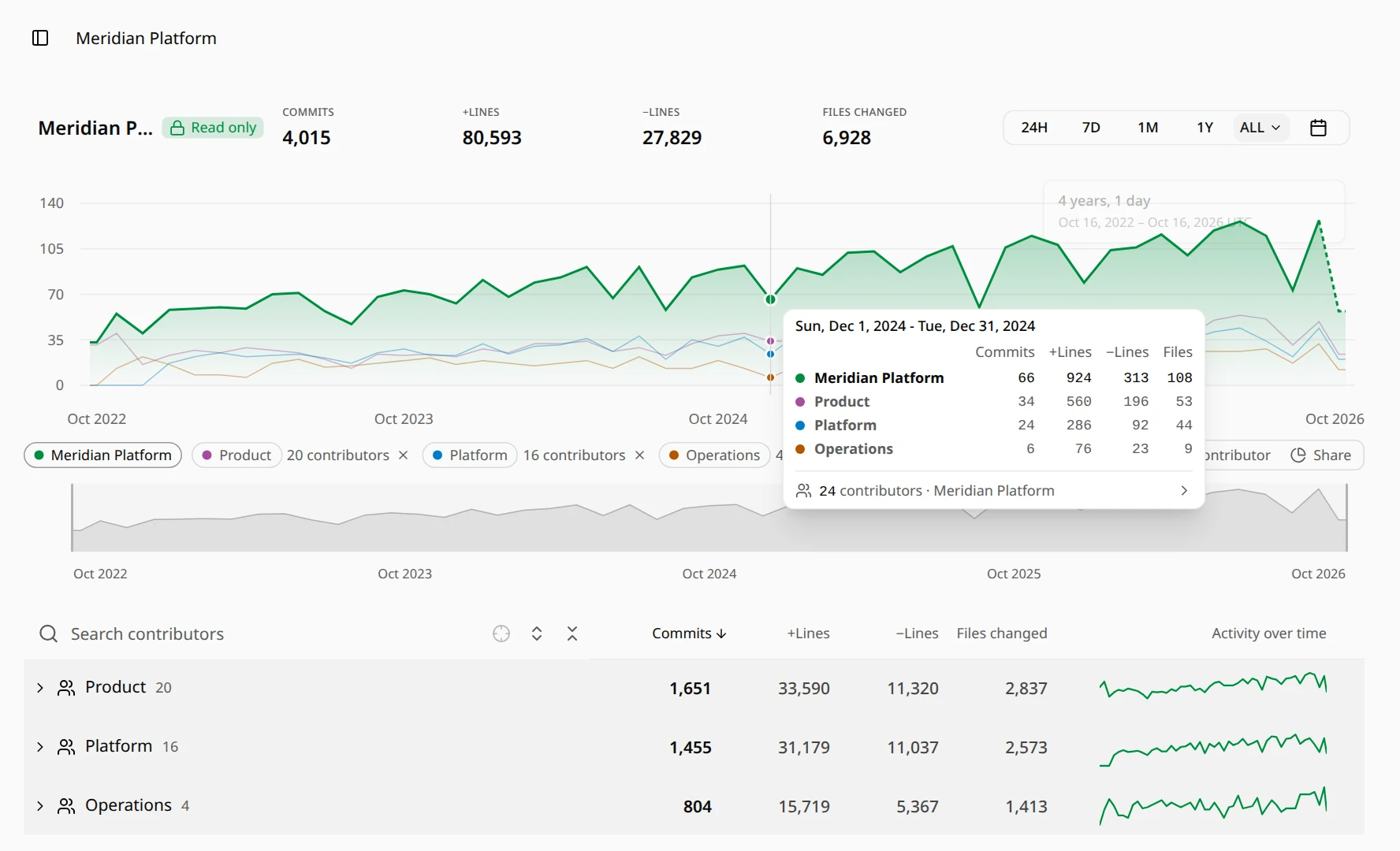
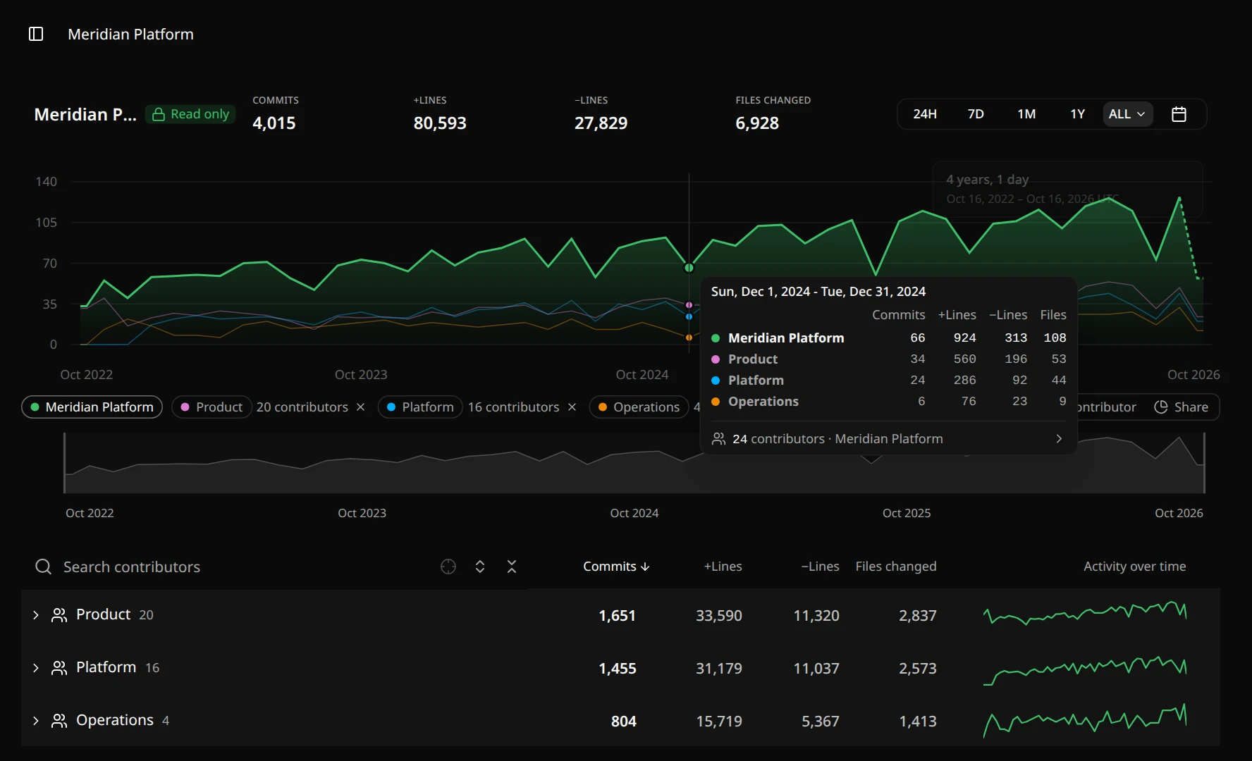
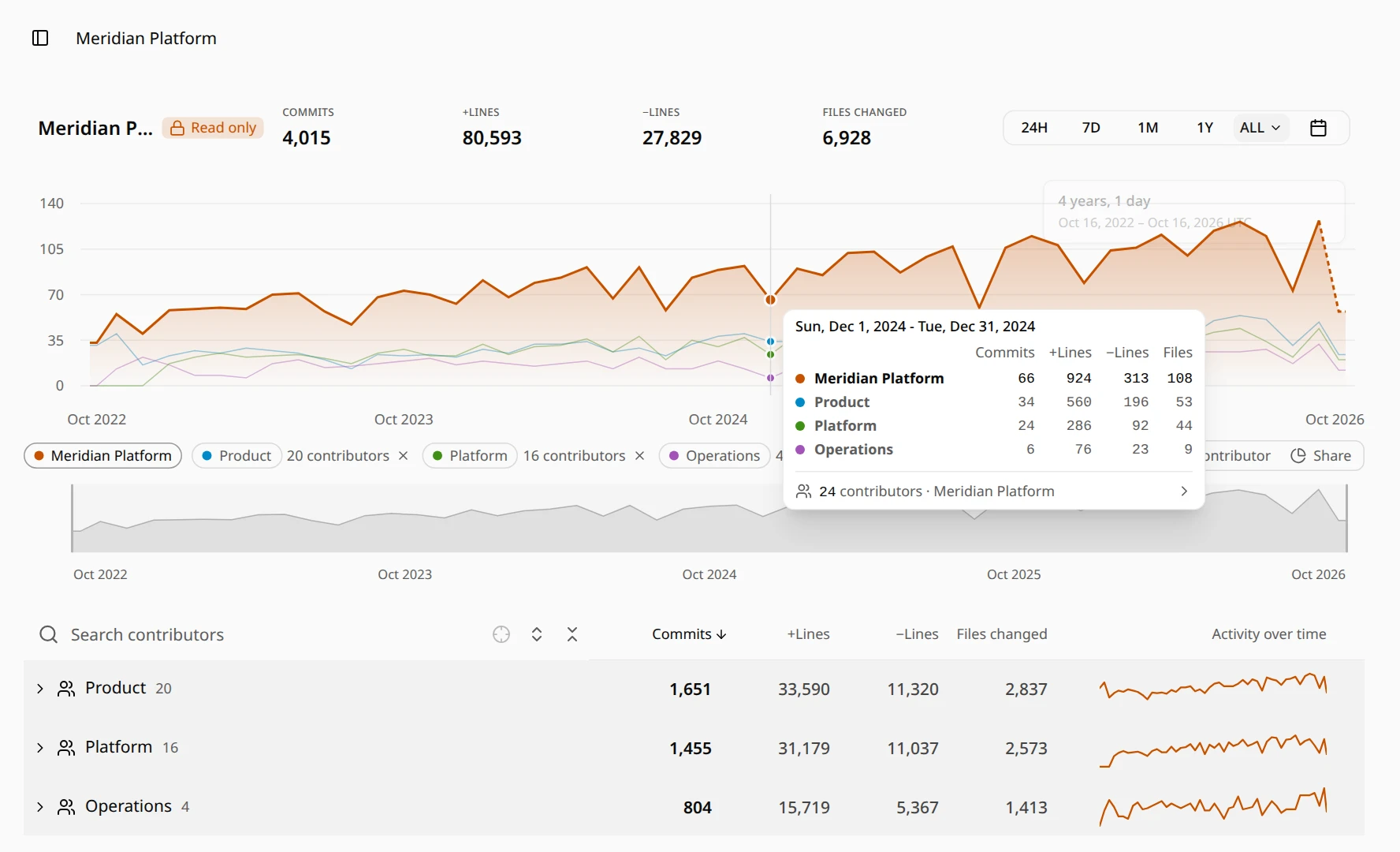
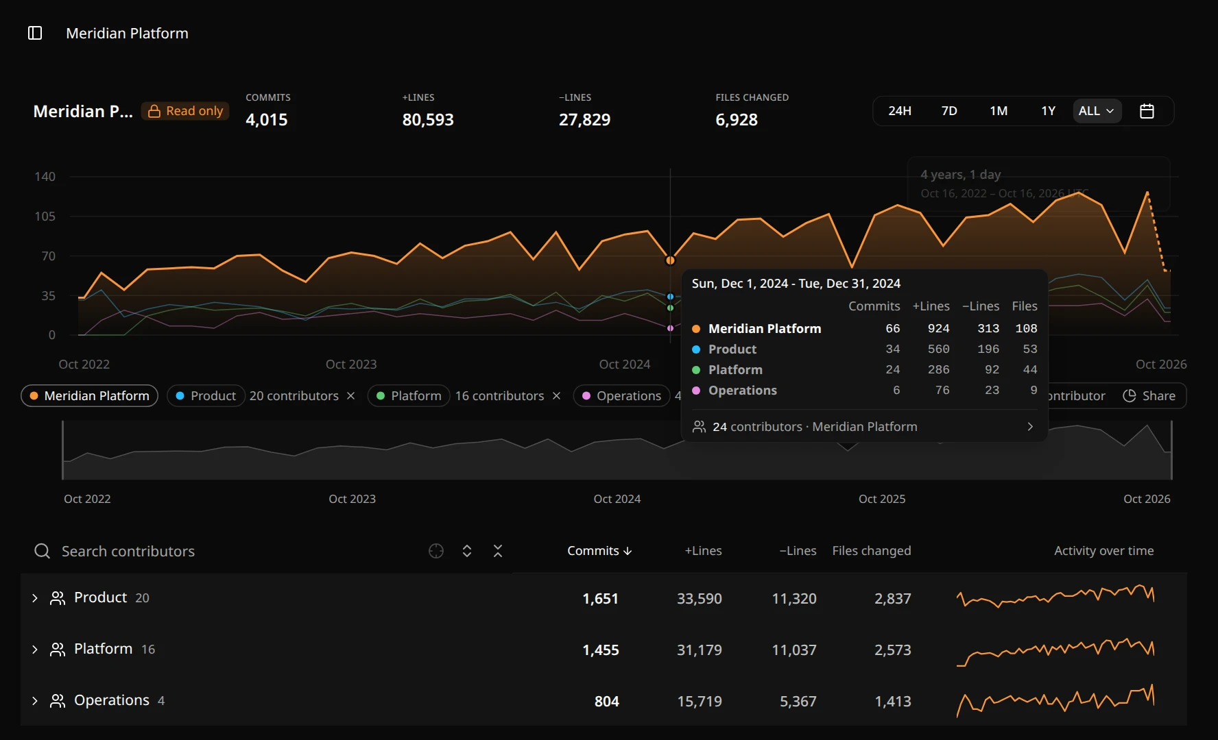
Put people and teams on the same activity chart as the folder or project you are looking at, and see how their work changes over the same time.
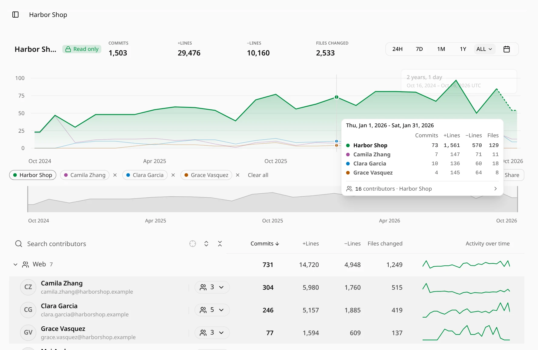
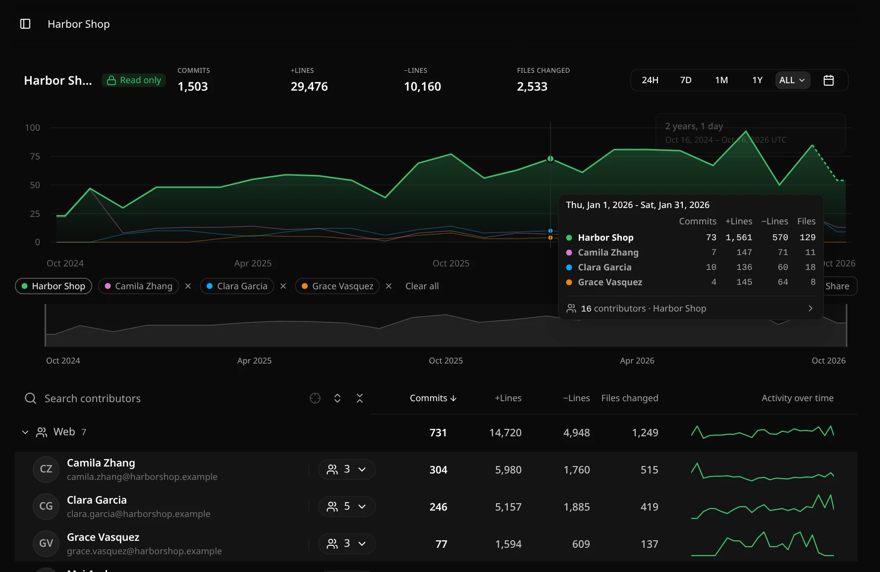
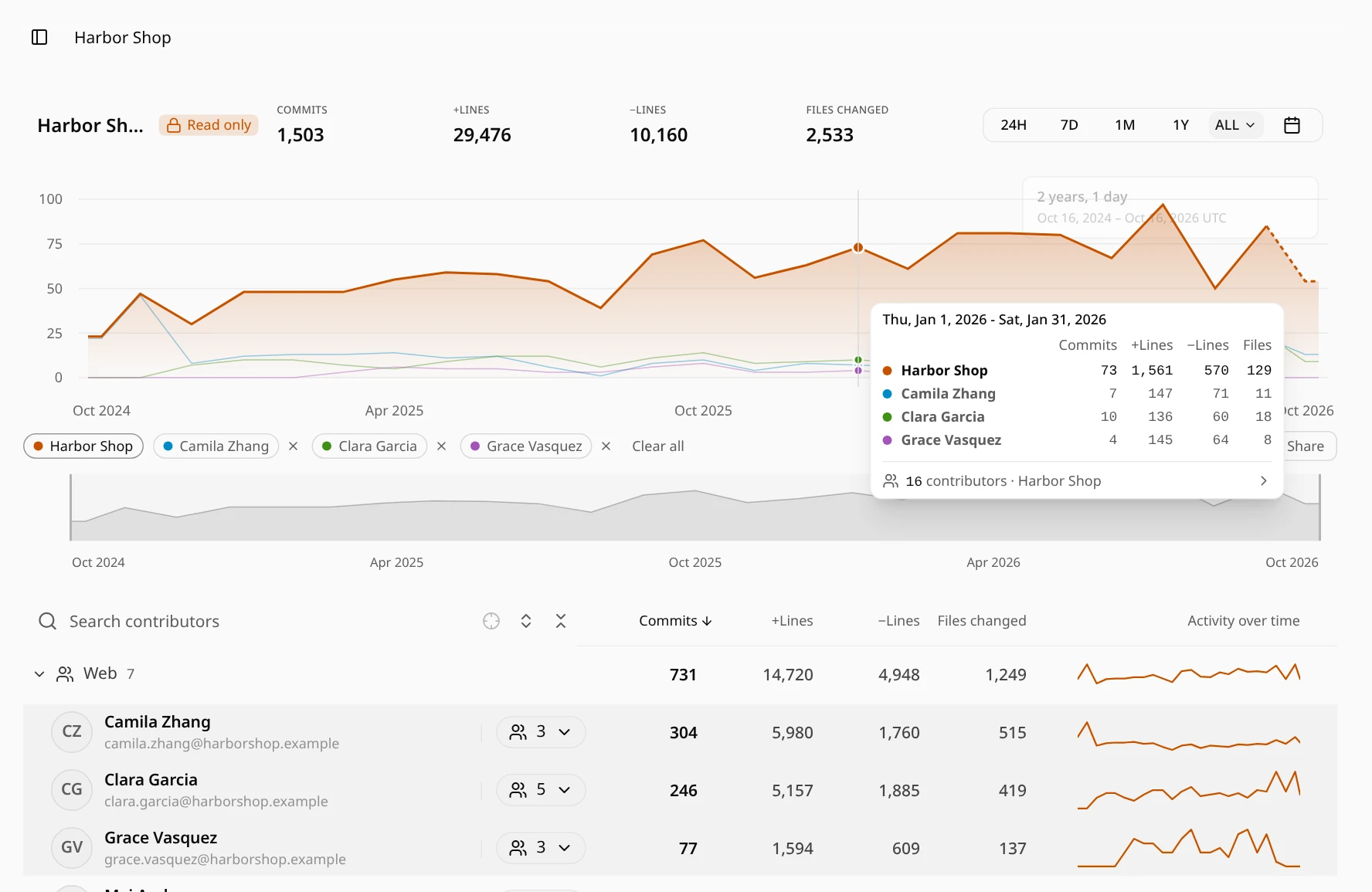
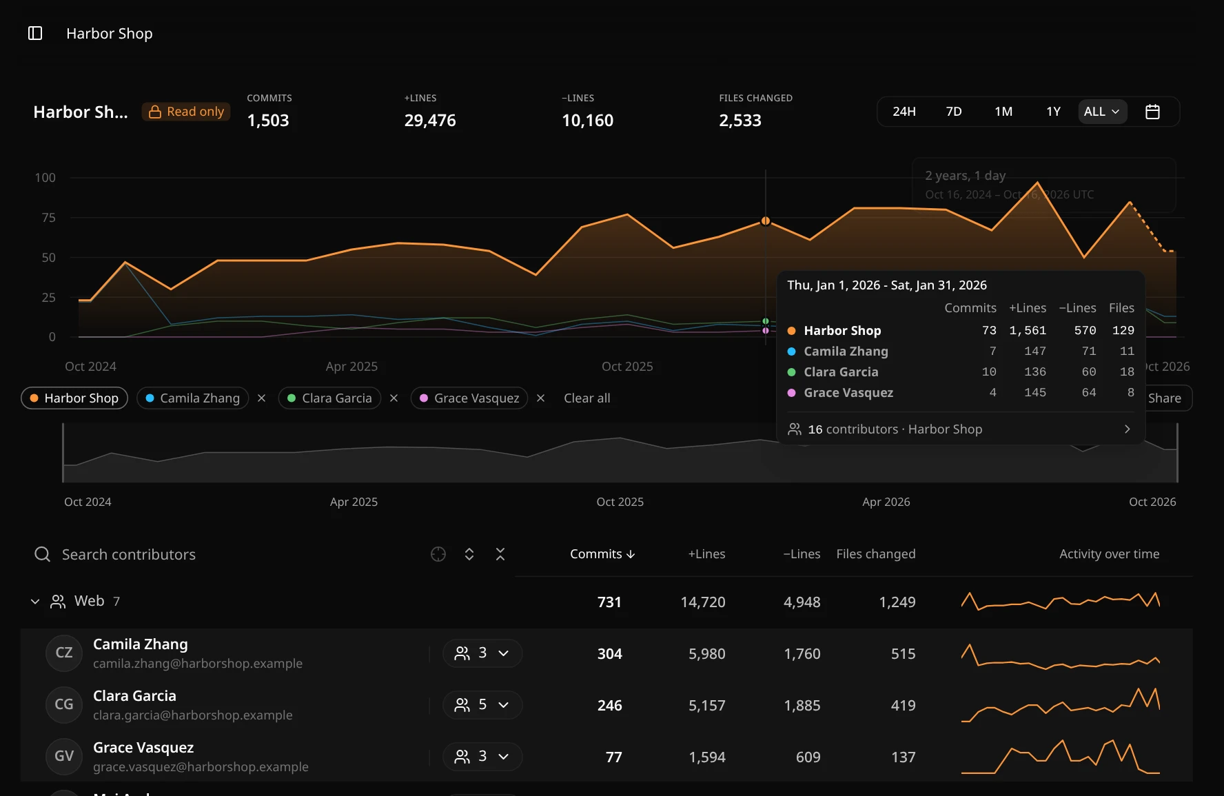
Add people and teams to the chart
- Open a person's or team's menu and choose Compare on chart.
- Drag people or teams onto the chart.
- Select several with Ctrl or Cmd, then choose Compare all on chart from the menu, or drag them all at once.
Each one gets its own color, shown in the list of names under the chart and as a tint on its row. Click a name to bring its line to the front, remove it with ×, or remove all with Clear all.
Three ways to read the lines
- Overall: commits as they are. Hover over the chart to see each line's commits, lines added and removed, and files changed for that period.
- Per contributor: a team's commits divided by everyone in the team, active or not, so small and large teams can be read side by side. The hover card also shows how many of each team's people were active.
- Share: each line as a share of all commits in the folder or project for that period.
Same range, same days
Every line follows the time range you choose. When you look at the whole history, the chart starts at the earliest first commit among them. Click a period to open its details as usual.
The chart is part of the page address, so a bookmark or a shared link opens the same comparison for anyone who can open the report.
Numbers are not scores
A comparison shows how activity differs, not whose work is better. Teams and people work in different ways; read the lines next to the changes behind them.
Plans
Without an account, you can have 2 teams or contributors on the chart, counting the chart's own line. Core allows 4 and Scale allows 8. Try it on a sample from the main page, or see plans and pricing.